


DEV LOG 1 - UI OVERHAUL (09/05/2025)
Lets try something new!
A Dev Log. I think this will be fun to do as a means to log my progress and changes and to just perhaps inspire you! I often do get the question of how I style my site and perhaps just showing how I did something and it's results would be benficial to a degree. Of course I cannot show CSS code all the time since I don't always keep a copy of old stylings when the new one suits but it overall depends.
A brief overview of what to expect in these logs is quite simply the changes I make to the site as it develops! You will most likely see me describe what I am doing alongide images with what was before and after alongside the challenges I encountered. I think this will at least help you learn a thing or two alongside talking about it being super fun for me. So here goes!
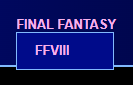
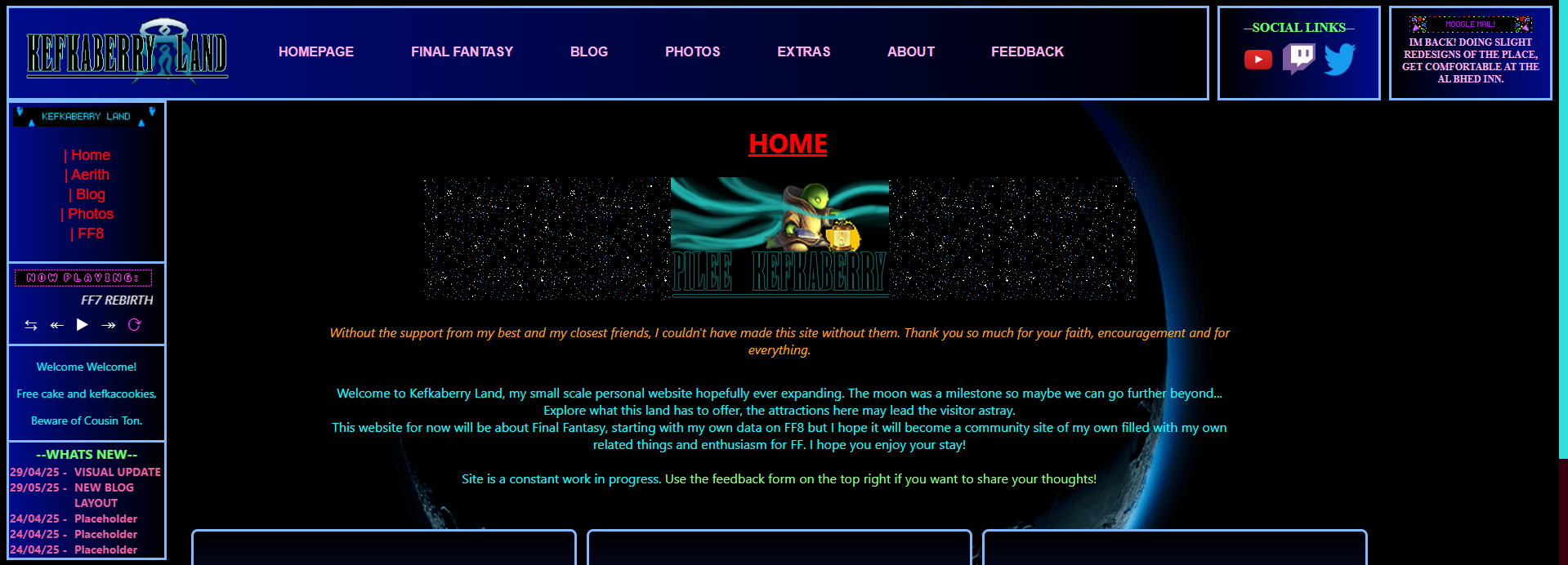
As you may have read the Future Plans blog, I have set myself to finally set goals and have a means to achieve them. This has begun with doing overhauls to the UI, especially regarding the navigation bar on the top of the site. The major problem I had with this bar initially was that the logo was merely two images and a heading inbetween. It served its purpose but it was only a starting point. This called for an actual logo and to overhaul the entire bar.
Old VS New:


This enabled more links on the nav bar than previously before and this actually help reduce CSS complications as previously it was all arranged into flexboxes
that had its own fixed width (silly, I know) whereas now constructing the nav bar with using unordered lists is much easier to work with.
A minor upgrade included a droplist when hovering over "FINAL FANTASY" that will make navigation easier in the future as shown:
This was all designed with the home page in mind and I wanted less on the screen without sacrificing detail. The vertical bar on the right side
was removed entirely to either be incorporated into the nav bar as previously shown or in the left bar, particulary "Whats New". It makes
Kefkabery Land a little compact and cosy! Perfect for the cold winters here.
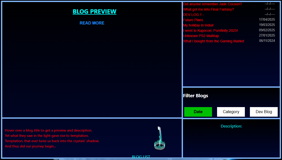
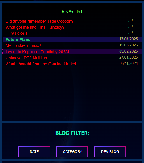
BLOG PAGE OVERHAUL:
As the new nav bar gives Kefkaberry Land a more modern look without sacrificing detail or charm, it was time to move onto areas that were
honestly half baked. Originally, the Blog page had a table of blogs with appriorate descriptions and dates however the table was just a
simple means to display them. A table is rather difficult to style with CSS and arguably preferred to be used with data instead of listing
content like this.
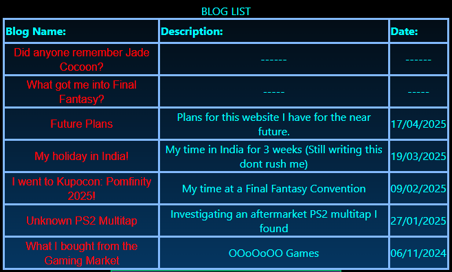
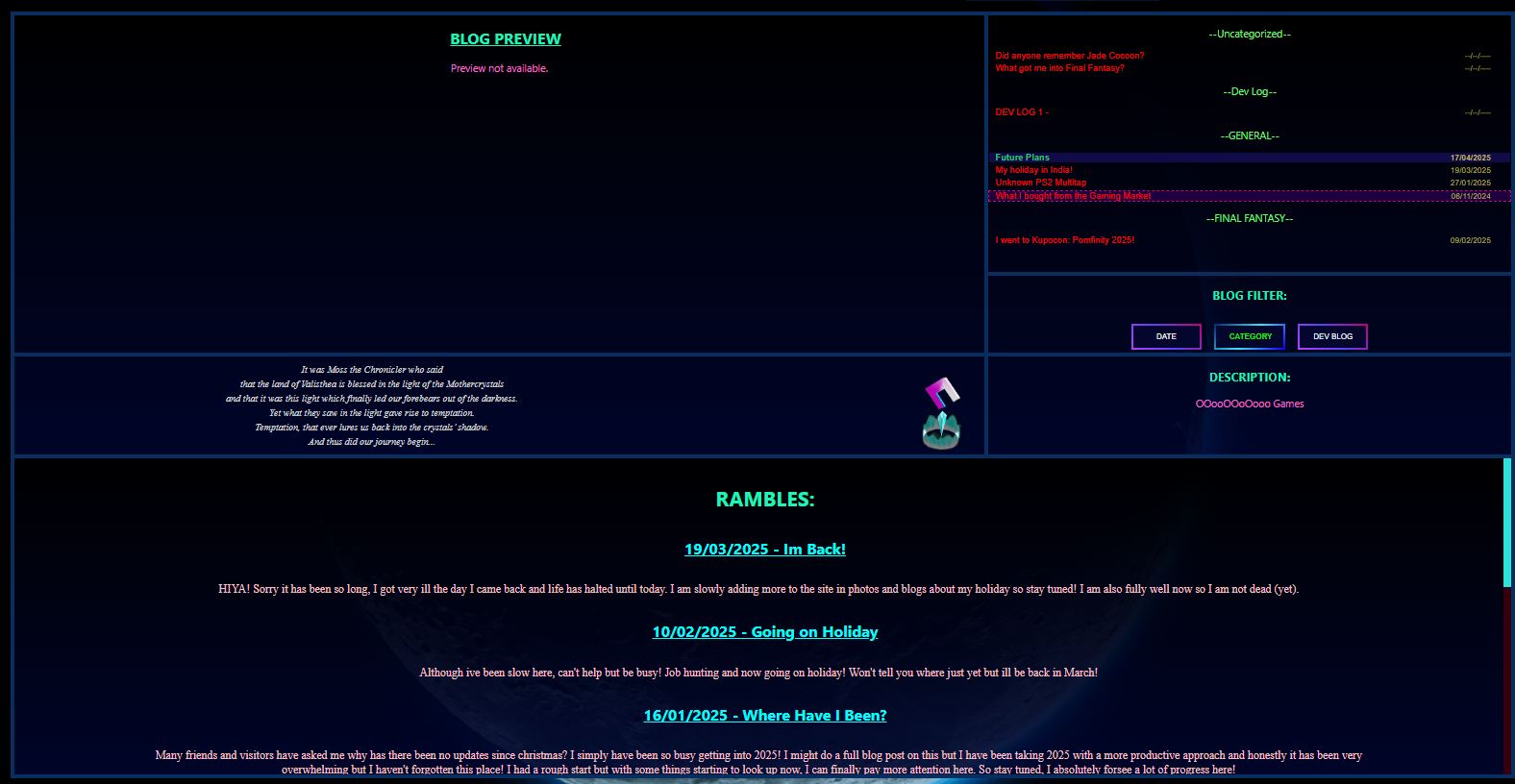
This called for a complete overhaul. Initially I intended to reuse the template I had for how I arranged the "EXTRAS" Page but it was proving to be quite difficult so I figured, why not try a whole new approach. I do not regret it. This involved using CSS-Grid, to arrange my content as a grid (what else). This was intially arranged into 3 boxes. The left box would be a blog preview and the right two boxes to equal the same size as the preview box so the whole grid remains square, detailing the blog list and the description.
Quickly I thought to add a fourth box under the preview box as the preview box was rather too large and plain for a blog preview and I like to
add some detail to any creation. This fourth box was to give instructions and just some filler nonsense to use up the space. Hey, the FF7 Save
Crystal appeared, did you save your game today?
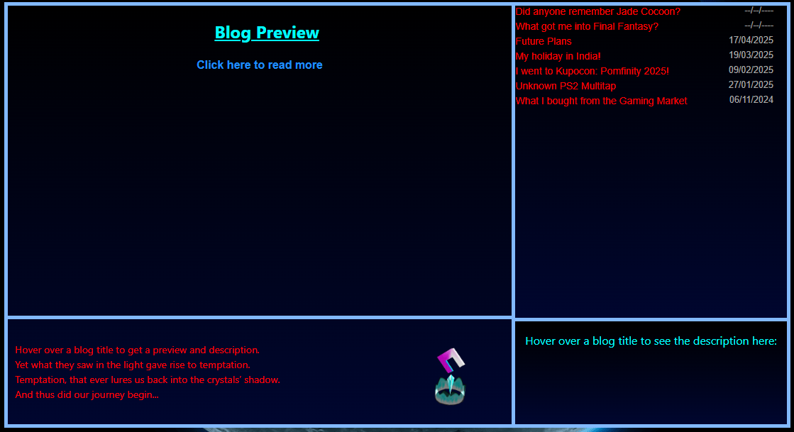
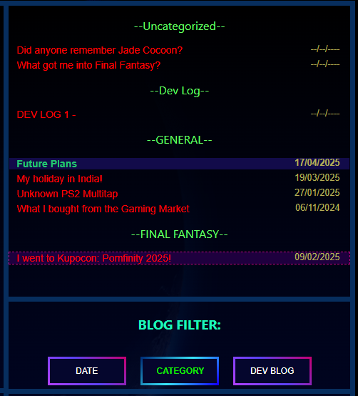
I got ambitious and wanted another box on the right side inbetween the two boxes to add a filter. This would get rid of the right bar on the screen
that categorised blogs and have it in this grid instead in a more intuitive manner. This approach reduces clutter on the page and honestly just looks
super good to have this upgrade. This new box would be the "Filter" box that would filter the list of blogs as configured.
I always make sure things work first before fully styling them so everything ESPECIALLY the green was ugly. There will be 3 filters for now: Date, Category and Dev Blog and when toggled, it would highlight as a different colour in case you forgot which filter you clicked on (it's okay, it happens) and the blog list above will be filtered and displayed respectively.
"Date" (Default) would arrange the latest blog on the top of the list and would always be highlighted via the use of JavaScript (uh oh) so even when filtering, the newest blog is easy to find. All the filters were made via JavaScript. Whilst I was really against using this for my website and only use it for optional means like the music player, it was necessary to make this new blog UI work as intended and I can not argue with the results. Furthermore, it was used to provide a preview when you hover on a blog link from the list, displaying the first 1200 characters of the blog in question that would be collected and displayed via the script!
Such ugly filter buttons get on my nerves so I had to style them. I looked online for some inspiration on button designs via CSS and I learned that borders can
have more than one colour (why was this a surprise to me after so long) so I styled to fit the vibe! It feels more cosy and no longer an eye sore, oh my god.
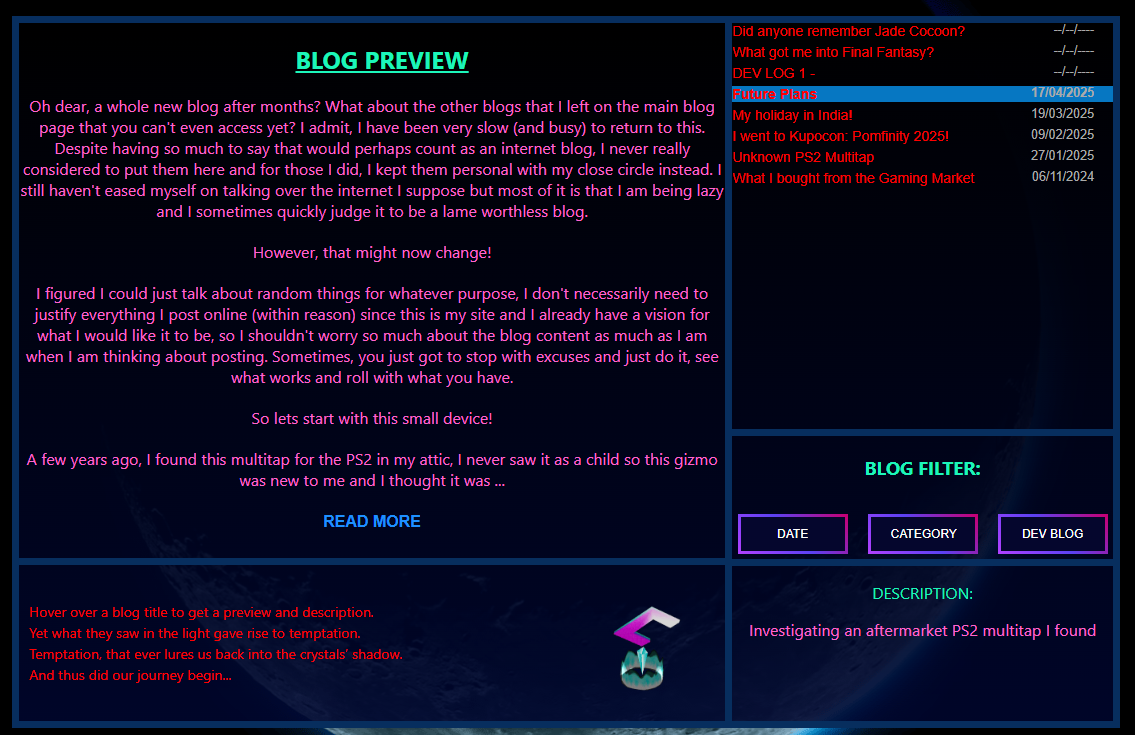
The functionality of the new blog UI is now done! woohoo!!!!!!!!!!
All that was left was to now style everything especially the text to make it more easier on the eyes. The save crystal box now has the opening of FF16 but now
when you hover over the save crystal, the chatbox appears on the left giving you a message. I may use this feature all over the site where necessary (it's a treat!).
You can also see the blogs being categorised with the "CATEGORY" filter being active, it all works!
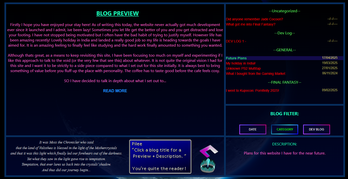
I am not always done so quick, I figured to add ANOTHER box below to incorporate the "RAMBLES" I have that lived below the discontinued blog table. This made it all
even more compact AND tickles the brain in a good way with less scrolling to do.
Additionally, to make it easier for mobile users in the future (see, I do care) I changed the preview function from working on hovering over the blog link to when you click
on the blog itself. Whilst this does involve the user to click on "READ MORE" to read the selected blog, it is more user friendly to have it this way whereas having it via on hover
was quite, a mess. You would hover over the wrong blog easily due to how close each entry was but this also help incorporate a highlight to the selected blog so you know which one you
are previewing. It will follow through when you click on a filter too!
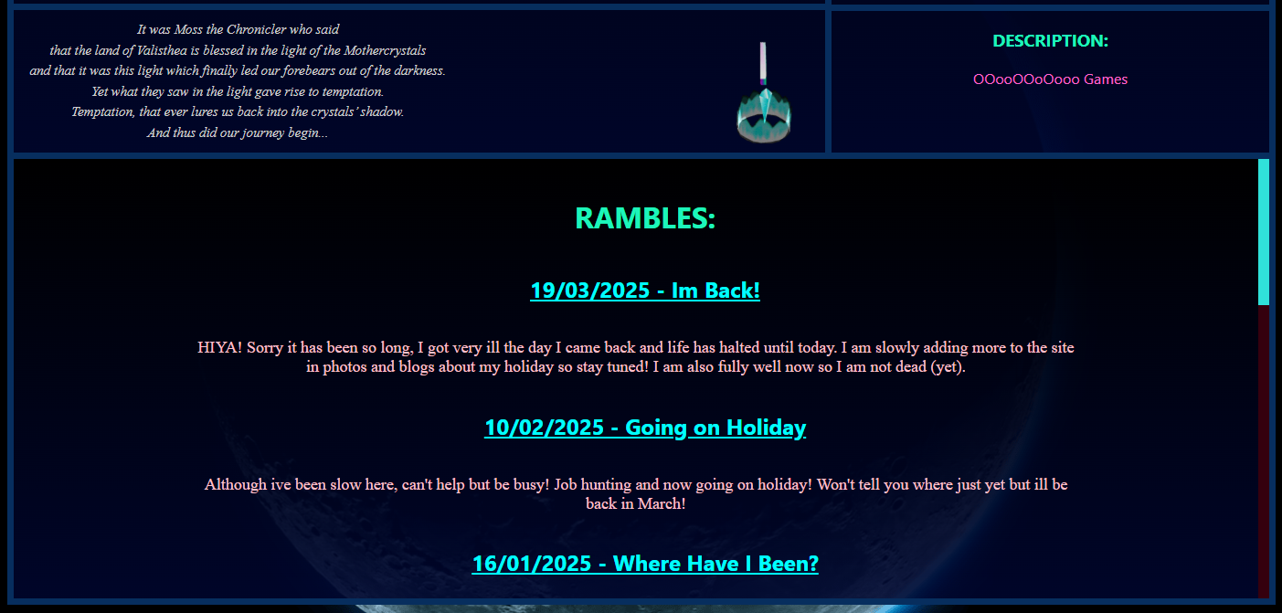
Here is the full complete Blog UI Overhaul:
See you in the next one! o/
See you in the next one! o/
See you in the next one! o/
See you in the next one! o/
See you in the next one! o/
I hope this inspired you to at least try something new or take this design approach, I hope it helps you achieve your design goals! Whilst it is stressful to constantly fix and adjust, it is always fun throughout and especially that feeling of satisfaction is waiting at the end.
See you in the next one! o/